Eight Principles of Effective Logo Design
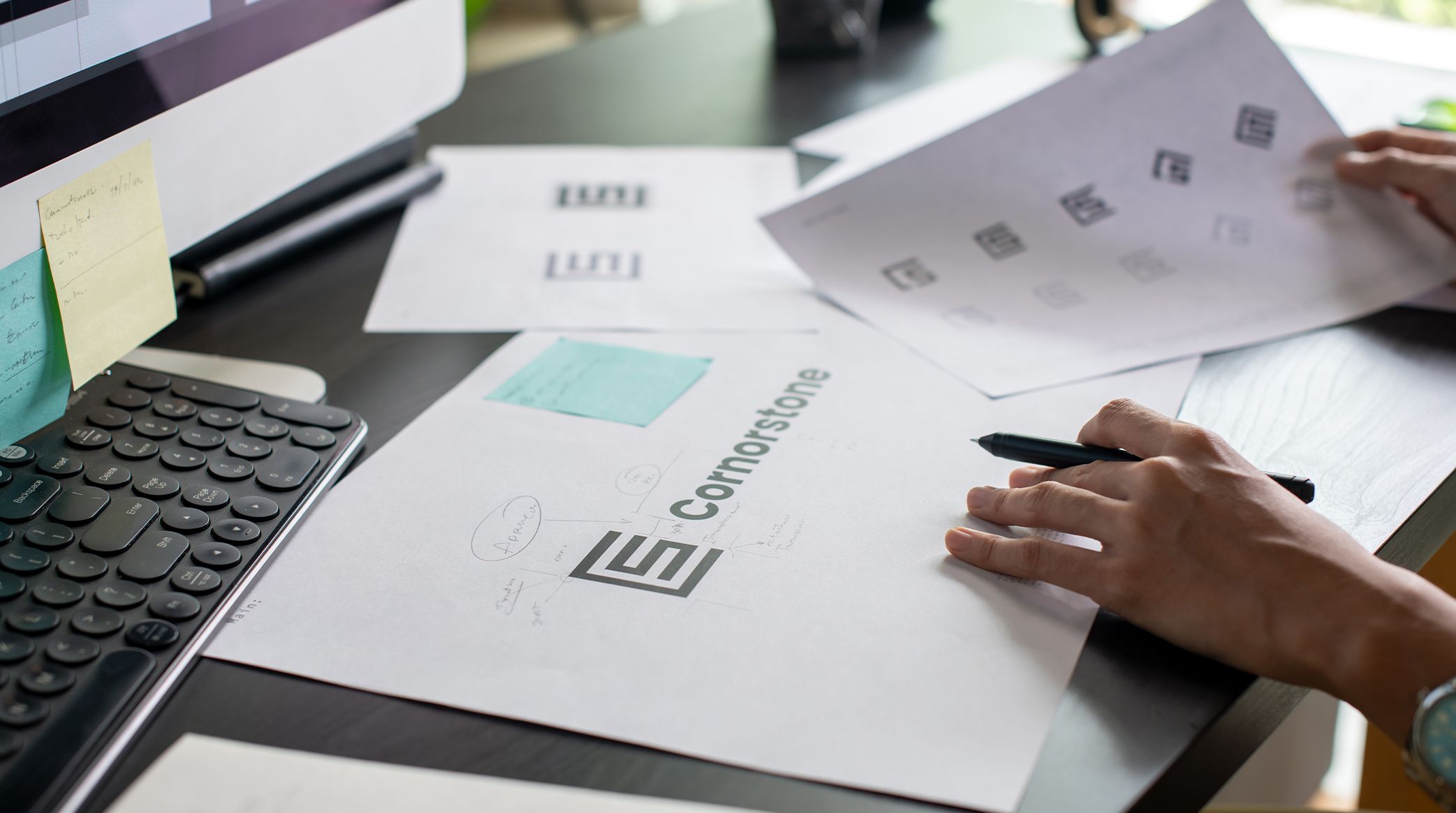
Hey, it's Lauren, Stimulus' graphic designer. Designing a logo may seem straightforward, but creating one that is impactful, memorable, and functional requires a thorough understanding of design principles. Often, when we are working with clients, we find that it might be difficult for them to determine what they want the logo representing their brand to look like. That's where we can help! Whether you’re crafting a logo for a small business, a nonprofit, or a global corporation, the foundation lies in eight essential principles that we have detailed below.
As a designer myself, I can speak first-hand about how these tips help us create beautiful, impactful and timeless logos for each of our clients. Let's get started!
1. Keep It Simple
Simplicity is the key to making a logo recognizable and versatile. A simple logo is easy to remember and quickly understood, whether it’s on a business card or a billboard. Think of iconic logos like Nike’s swoosh or Apple’s silhouette—they’re impactful without being overwhelming. And while brand recognition might keep your business from being that simple, it's always a great mindset to have. It is also important to consider what types of media or designs your logo will appear on, as a simple logo is the most versatile for various outputs. Designs that are too complex tend to confuse the viewer and are not readable in smaller sizes.
Stimulus Pro Tip: Avoid cluttering your design with too many elements or colors. Focus on a strong, singular idea with one main element.

2. Make Sure It’s Scalable
When we work on a logo, we make sure that the design is not only great for large usage, but that it also is strong enough to work on a pen. Remember, a great logo works at any size—from a tiny favicon to a massive building sign or billboard. Scalability ensures that your logo remains clear and effective no matter where it appears. A logo that is versatile in different sizes and formats helps create brand consistency and recognition because it does not require alteration.
Now this isn't always something that the business owner should have to worry about. Just make sure you are working with a trusted designer who you know will put this step into practice.
Why It Matters: If your logo relies on intricate details, those elements might get lost when scaled down.
3. Make It Timeless
This is where we like to shine the most. My team at Stimulus works hard to create logos that don't have to change too much over time. Think about Pepsi and Coca-Cola, or even WalMart. All of these brands have had very similar logos for a long period of time, but have chosen to make slight improvements throughout the year. That's the sign of a good logo. Something that can be simplified or modified overtime, but never loses the overall impact or brand identity.
Trendy designs may look great today but can feel outdated within a few years. A timeless logo balances modern appeal with lasting relevance. Avoid hyper-focusing on trends and over-stylized designs that have a short shelf life. This can include color palettes, fonts, icons, etc.
How to Achieve It: Learn the difference between a fad and a long-lasting solution. Need another hint? Check out our blog about the rise of the "Wedding font" and how it has become trendy, but may not last as a style for most brands.
4. Give It Some Flavor (some character)
Your logo should reflect your brand’s personality and values. Whether it’s playful, sophisticated, or bold, the design must communicate what your business stands for. This also helps the consumer discern the nature of your business. Adding some character (flavor or flair) to your logo helps it to stand out among your audience and competition.
Some businesses require more. Maybe your brand is very simple or clean. Well, that might be the perfect opportunity to go with a nice text-based logo. However, if your business is more than just an aesthetic, you might want that to be reflected in your logo. These are all good things to consider when creating your logo.
For example, a quirky font might work for a children’s toy store, but a sleek, minimalist design suits a tech company. Let your brand’s identity shine through!

5. Don’t Be Afraid of Fonts
Typography is a powerful design element. The right font can elevate your logo and convey the brand’s tone, while the wrong one can make it feel off-brand or amateur. For example, a brand with a more modern feel may primarily use a sans-serif font in their logo. This is because sans-serif fonts provide a sleekness and simplicity that communicate a modern feel. Alternatively, a serif font may be best for brands such as banks or institutions because it communicates tradition and stability.
While fonts can be all fun and games, it is important to remember the first principle we discussed...simplicity.
Tips for Fonts: Make sure the font is readable...please and thank you.
6. Keep Your Target Audience in Mind
Your logo is ultimately for your audience, not just for you. Think about what resonates with them while communicating your brand. Tailoring your designs to your audience can help conversion ratings, and allow you to better connect with your ideal customer base.
Questions to Ask:
- What is the demographic of my audience?
- What colors or symbols appeal to them?
- How can my logo solve their needs or expectations?
For example: A bold and sporty logo would appeal to fitness enthusiasts, while softer, pastel tones may connect better with a luxury spa audience.
7. Use Color Strategically
Color isn’t just an aesthetic; it’s a psychological tool that evokes emotions and associations. Choose colors that align with your brand’s identity and purpose...they don't have to match perfectly to your brand colors. This is a time where you can work to find harmony between your logo and your overall brand.
Now, let's revisit simplicity one more time (there is a reason it is the first item on our list). Sometimes you might find that your logo is too simple or too complex. There is an art to finding the perfect balance. Don't overload your logo with too many colors. You want to ensure that it can be printed in black and white and remain recognizable. But also make sure that your logo isn't too boring that it doesn't stand out (especially if your business is more fun and playful).
Best Practices:
- Limit your palette to 2-3 primary colors.
- Ensure the logo works in black and white to maintain versatility for various media and print.
Example: Green often symbolizes growth and eco-friendliness, while red conveys passion and urgency.
8. Test, Refine, and Adapt
Even the best designs benefit from testing and feedback. Share your logo with stakeholders, test it in real-world applications, and refine it based on insights. Be sure to distinguish between helpful feedback and individual opinions when bringing additional voices into the conversation. Listen and evaluate all of the feedback you receive and then make the best decision for your business.
If your designer has done his or her job correctly, you should be faced with a variety of designs that evoke different feeling snad emotions. This should help you narrow down which logo you prefer.
Your Logo is Your Brand’s First Impression
Well, there you have it—eight principles of effective logo design. Whether you are choosing the capable team at Stimulus, have your own designer, or are even a designer yourself, we hope that you have learned a little more about creating a simple, impactful and beautiful logo for your brand.
Remember, a thoughtfully designed logo serves as the cornerstone of your brand identity. By adhering to these principles, you’ll ensure that your logo is not only visually appealing but also functional and memorable.
If you need help designing a logo that captures your vision and connects with your audience, contact Stimulus Advertising. Let’s create something remarkable together!

Lauren Harkness
Graphic Designer
Need Help Implementing these principles?
Let Stimulus Advertising be your go-to advertising and marketing agency for branding and logo design services. We do more than design a logo, we create your brand, helping give you a visually appealing and recognizable face to the market. Check out our Branding page to learn more about how we can help you or schedule your free consultation today!


