12 Rules for Every Billboard Design
After 15+ years in business, we like to consider ourselves experts on everything that is outdoor advertising — including BILLBOARDS! Over the last few years, we have witnessed several mistakes businesses tend to make when starting a billboard campaign. We find that many companies solely focus on billboards that have the highest viewing counts. While important, and certainly a key part of the strategy, there are other factors that many businesses (and some agencies) tend to neglect. Below are 12 rules that we have learned to put into practice with each billboard campaign that we can produce.

1. 3-Second Rule
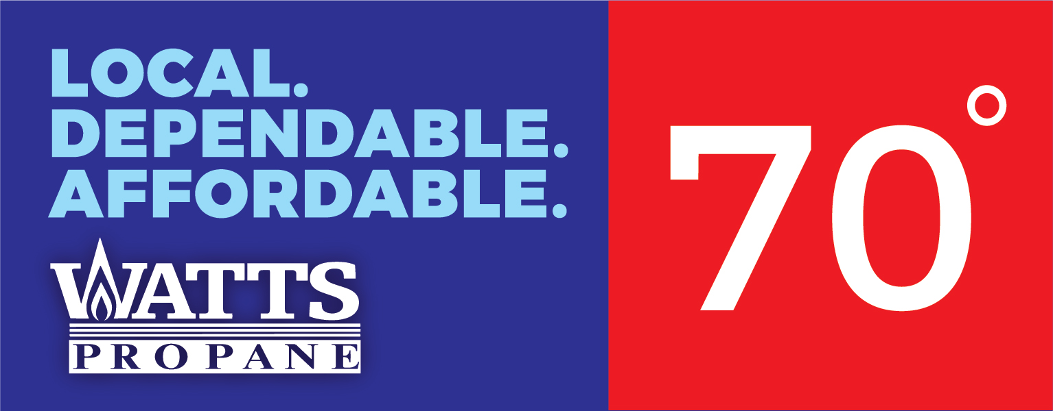
The 3-second rule is simple: the viewer should be able to gather all the information on the billboard in under 3 seconds. That can be tricky to do, but the best billboards get right to the point and are easy to understand. (Even when you're driving 80 mph.)
2. Remove the Clutter
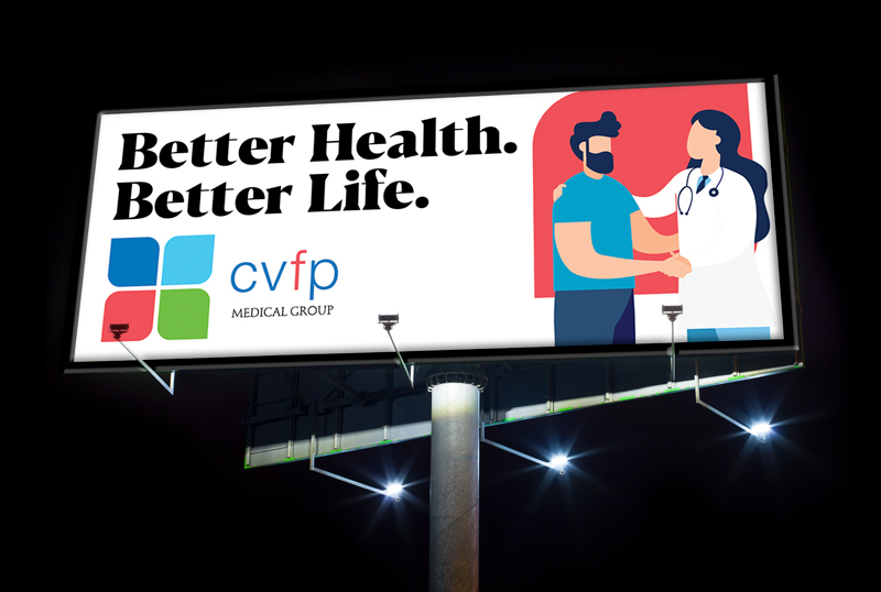
The number three also comes in handy with this rule. Keep design elements to a minimum. Three elements are ideal! That means picture/graphic, call-to-action and logo. Send the message to your audience without the clutter and confusion.
3. Non-Readables
Why take up space on your billboard with things that aren't needed? Most people miscalculate how much actually needs to be on their billboard. If you're going to include a web domain (which we don't recommend), don't include "www.". Phone numbers are also a no-go. The chances a viewer will remember your phone number while they're flying down a highway is slim to none. Not to mention it's also dangerous!
If your billboard has a catchy headline, clear call-to-action and your company's name, you're all set. Resources like Google have simplified the process of getting more information about a business.

4. Color Matters
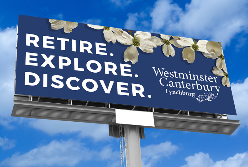
Color matters a lot. Keep the colors bright and raw — strong and defined so they don't blend in with the environment around the billboard. Digital (LED) billboards are good because the RGB mode offers a wider array of colors.
Although canvas wraps are less expensive, print colors (CMYK) are often duller and harder to match to the original color. Keep in mind, canvas billboards lose on average 20% color intensity every year.

5. The Big Idea
As David Ogilvy quoted, "You will never win fame and fortune unless you invent big ideas. It takes a big idea to attract the attention of consumers and get them to buy your product. Unless your advertising contains a big idea, it will pass like a ship in the night."
When brainstorming a billboard, Stimulus aims for the "Big Idea." Our goal is to create something that's hard to forget, will catch your attention and leave passersby with a desire for more information.

6. Build a Campaign
The purpose of a campaign is to maximize the value of billboard placements by using the same design/theme. If you are going for a similar theme, make sure There can the billboard designs don't change too much. You will want your designs to remain consistent with the campaign theme, ultimately increasing brand look, feel and presence.

7. Location
8. Location, Location.
9. Location, Location, Location.

10. Headline With Purpose
11. Call to Actions

12. New Ways of Advertising
Need a good billboard design for your company?
Let Stimulus help you with all of your outdoor design needs!