Harmony Day Support
Brand Redesign
In Perfect Harmony
When most people think of the word "harmony," they typically think of music. While their assumption isn't wrong by any means, it goes deeper than that. The actual definition of the word harmony has three parts:
Harmony
(noun)
- the combination of simultaneously sounded musical notes to produce chords and chord progressions having a pleasing effect.
- the quality of forming a pleasing and consistent whole.
- agreement or concord.
For this branding project, we are going to focus on numbers two and three but will show you how number one fits in harmoniously (see what we did there) when all is said and done.
The Need for a Pitch Correction (Problem)
Before we dive into the problem (or the pitch corrections), it's important that you know a little more about who Harmony Day Support is and what they do for their community.
About Harmony Day Support
Harmony Day Support, Inc. is a 501(c)3 nonprofit organization that provides individual encouragement and support to adults and adolescents with various levels of Developmental Disabilities, leading to harmony and balance in their daily lives. They provide daycare support services throughout Central Virginia at their Lynchburg care facility.
Over the years, Harmony Day Support has continued to grow in the community. They provide services that are needed by many and have established themself as a quality care facility in the area.
Due to their standing in the community, Harmony Day Support needed a logo and brand that would embrace their growing success. They needed something that was going to help them stand out in the crowd, something that represented their organization, and most importantly something that could grow with them. They gave us a call to help them achieve just that.
The Hopeful Song (Goals)
-
Create a clear, cohesive brand identity that aligns with the facility's mission and vision
-
Create a brand that represents Harmony's diverse clientele and the members of their organization
-
Create a brand that the organization can grow into and utilize to expand
-
Effectively roll out the new brand to people throughout the community, gaining excitement and exposure
The Tuning Process
Our branding process is fairly straight forward. After 20 years of creating brands, we have found a method that provides our clients with a positive rebranding experience, while also ensuring that things are done in an order that is clear, concise, and easy to follow. This project was no different. We followed three simple steps in order to complete this branding project.

Assessment & Research
Objective: To understand the current brand perception and identify areas for improvement.
This initial step involved conducting thorough research. We assessed competitors, others in the industry as well as thought-leaders within the field. We also had thorough conversations with the client to become an expert on their organizaiton and in their field of expertise.

Brand Strategy Development
Objective: To create a clear, cohesive brand identity that aligns with the facility's mission.
Creating visual elements such as the logo, color scheme, and typography. The strategy served as a blueprint for all branding efforts, ensuring consistency and clarity in communication thoughout all media and interacitons.

Implementation
Objective: To effectively roll out the new brand identity across all media and engage stakeholders.
This step involved applying the new brand elements to various aspects of the facility, including the physical location, marketing materials, online presence, and staff training.
Finding the Right Note (Designs)
Once we were able to create shared goals and complete step one of our process, it was time to start designing. As a marketing and advertising agency that has designed numerous logos throughout the year, we know that creating a brand takes a keen eye, focus and an overall strategy. It's more than just drawing an emblem or selecting a font, it's all about bringing harmony to the overall message that you want to create. This includes the design, the words, the positioning, etc.
When it came to this project, we wanted to ensure that our designs reflected the organization's overall image, the feelings they bring to the members and the promise they make to each of the families connected to the organization.
This is how we created the tagline
"Empowering Lives Every Day!"
This strong and bold statement completely embodies what Harmony Day Support does for its members each and every day. Below are just a few of the designs we came up with after establishing the overall messaging.
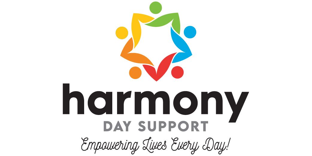
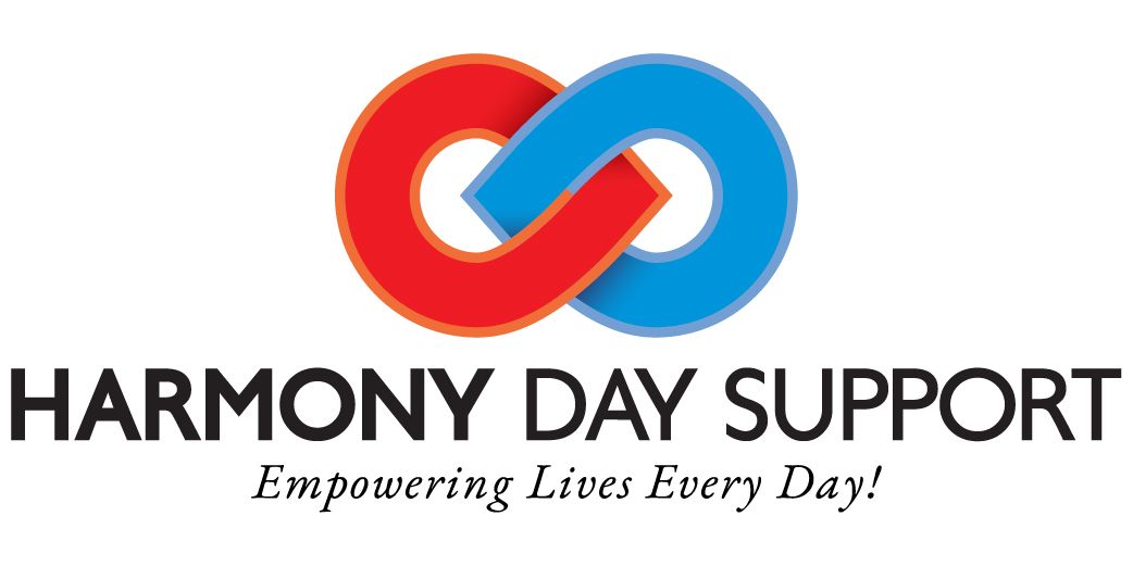
When designing a logo, it's important to have options. Options allow the client to think outside of the box while giving them a few different things to think about as they work towards a decision.
Creating the Melody (Decision)
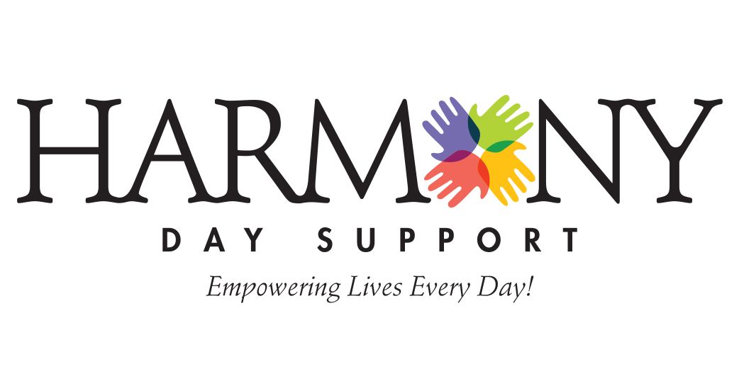
After thoroughly evaluating all of the designs, Harmony chose a bright, fun and visually appealing logo to represent their brand. This logo hits on three of their goals. The colors of the hands showcase harmony, diversity and coming together, as they create the "o" in the word "harmony."
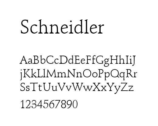
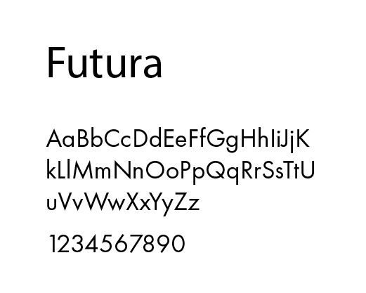
The two fonts within the logo also work together to create balance and help the logo stand out against other options.
Each part of this design was carefully thought out and planned to ensure that Harmony could use this logo for years to come.


Putting it all Together (Launch)
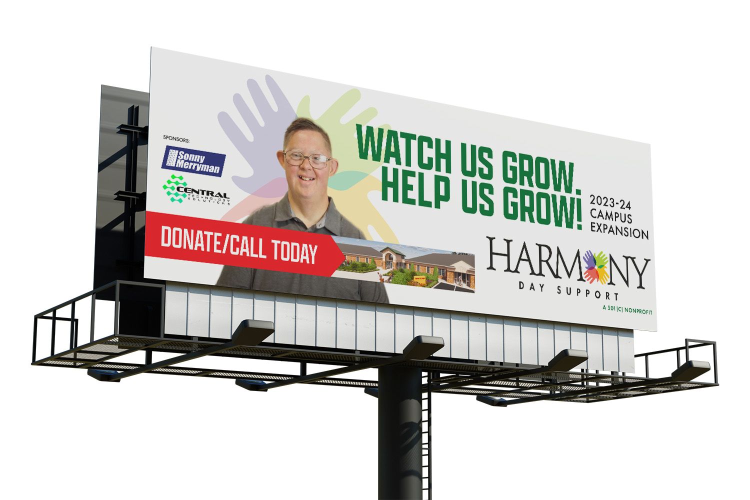
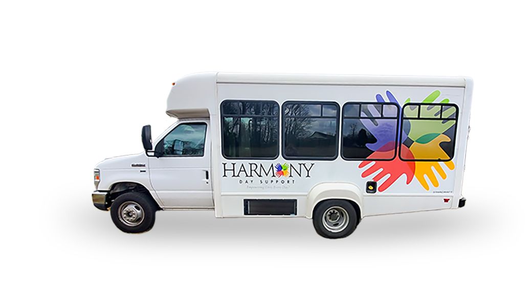
After creating the brand and deciding on a logo, it was time to take on goal number four and effectively roll out the new brand. The logo became a primary portion of their vehicles, making an eye-catching and impactful moving billboard for all to see.
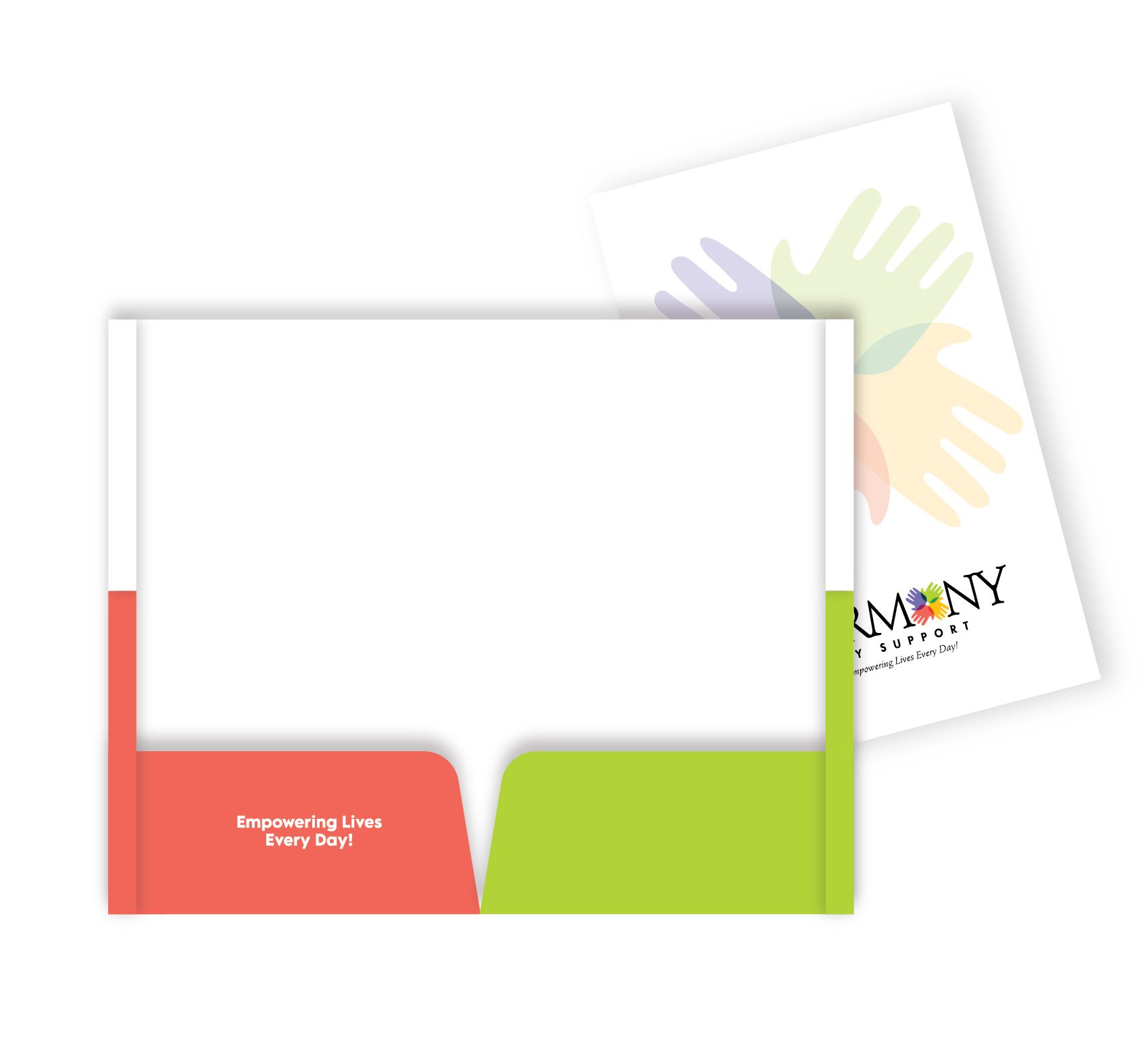
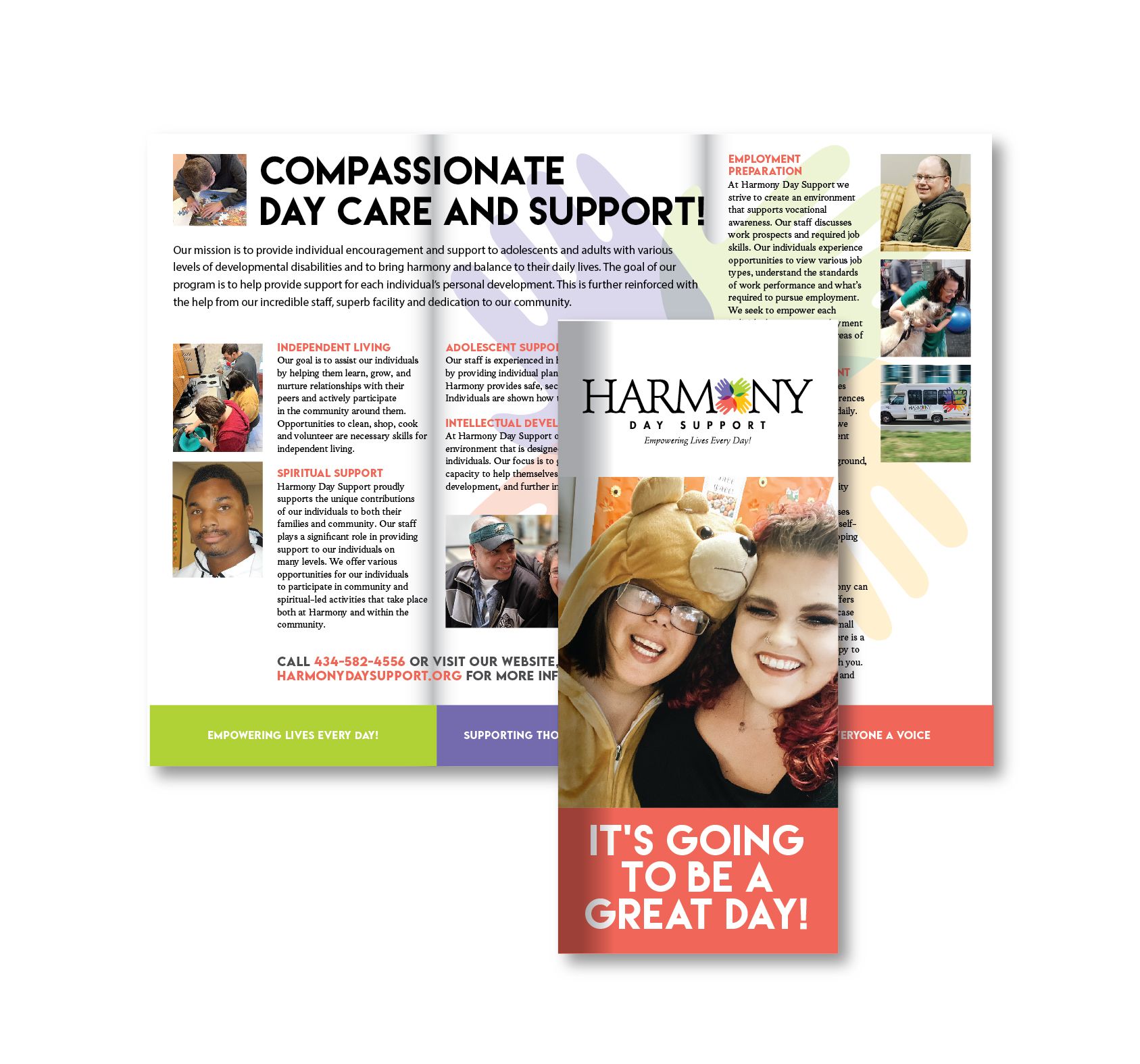
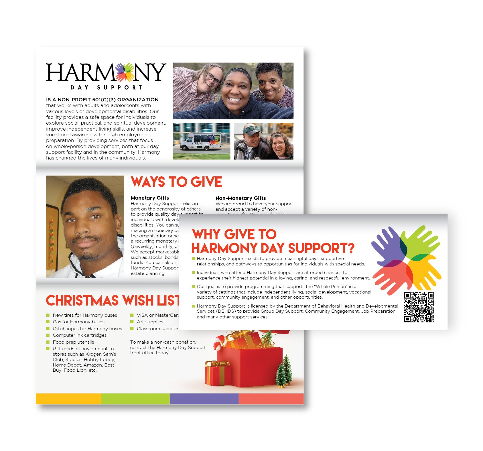
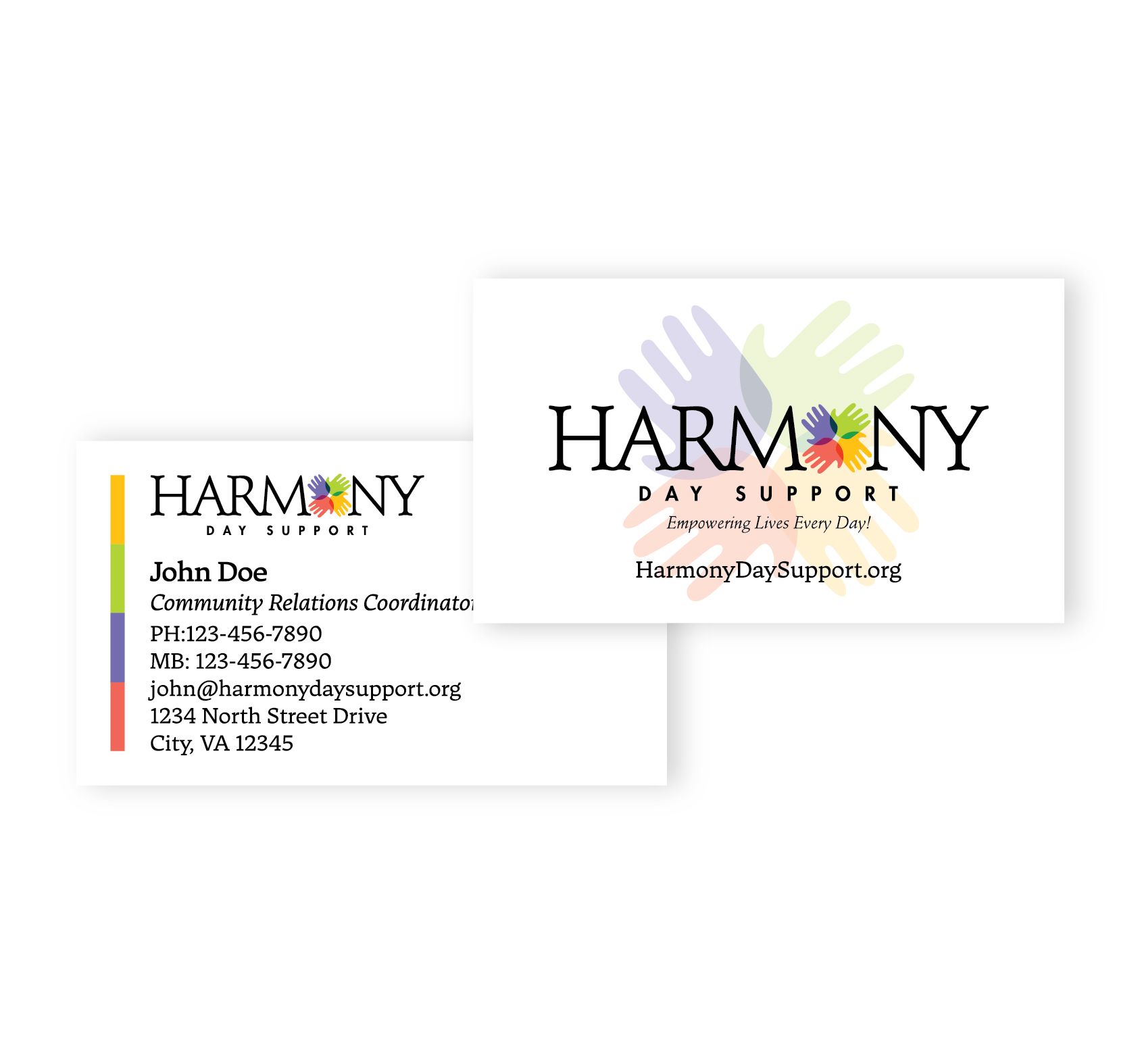
The logo was also implemented on print collateral, social media, billboards and more.
The Release (Results)
The Harmony Day Support rebrand was a complete success. It's not always easy to rebrand, but with the right team, the possibilities are endless.
Our simple and effective process allowed Harmony Day Support, Inc. to effectively launch its new brand throughout Central Virginia. The logo was versatile enough to be used in multiple places, including effective and eye-catching vehicle wraps.
This brand came together in the most harmonious way. If we revisit the definition from the beginning, each element of the logo came together to form a "pleasing and consistent whole." Each element also works in agreement with each other. As for the simultaneous musical notes, we think this logo sounds beautiful. The colors, the fonts, the layout and the words sing a song of beauty and peace.
The most important result—the one we care about the most—is that the client was pleased with their design and the process.
Looking to rebrand and need a strong team to help you accomplish it? Get in touch with Stimulus Advertising today.
