Collaborative Health Partners
Brand Redesign | Full-Service Marketing
Redefining Healthcare Excellence—In Style
Every healthcare practice deserves a quality brand presence that fully represents its organization to current and potential patients. It should be modern, exuding trust and care. It should also be impactful and stand out amongst all of the noise. That’s exactly what we were able to provide for Collaborative Health (Collaborative Health Partners), an integrated healthcare practice in Central Virginia.

Background

Collaborative Health Partners
Collaborative Health Partners (CHP) was originally an entity that focused on employee health. The goal was to create a network of local healthcare practices that "collaborated" (hence the name) in order to support local businesses and their employees.
The network provided access to workplace health services along with workers' comp, physical therapy, wellness and more.

Liberty Mountain Medical Group
Liberty Mountian Medical Group (LMMG) was a healthcare entity that provided specialized care services to the general public. The practice was directly linked to Liberty University's College of Osteopathic Medicine (LUCOM).
This practice was managed by Collaborative Health Partners, although to the public it was seen as a separate entity.
Collaborative Health Partners came to Stimulus Advertising with the hope that we could help them merge the two brands into one—And that's exactly what we did.
The Goals
There were three distinct goals set for this project. Each of the goals was crucial to the overall success of the project. They were as follows:
-
Successfully merge the CHP and LMMG brands and establish strong brand positioning.
-
Design a new website that effectively communicates the new brand's services and offerings to both the public and employers/employees.
-
Effectively promote the merge the new brand to both current and potential patients, raising awareness.
Our Process
Because this was such a big project, we needed to ensure that the process we implemented was both effective and impactful.
Our process included five simple steps:
- Research, Brand Message & Unique Selling Proposition
- Brand Name, Identity, Style Guide and Logo Creation
- Brand Launch
- Website Launch
- Supporting Collateral & Deliverables
While many advertising and marketing agencies might start with the logo design, colors and feelings, we knew that we needed to start at the beginning.
1. Research, Brand Message & Unique Selling Proposition
There would have been no benefit to getting into the design if the base communication wasn't correct. The message and the target audience are two key parts of any successful brand.
Since we had been working with CHP since its conception in 2014 and with LMMG since its creation in 2018, we knew quite a bit about both target audiences. However; we wanted this to feel new. With the two brands merging together, it was even more important that we sit down with the CHP stakeholders and gather all of the information we could about future goals, overall vision and desired markets.
Liberty Mountain Medical Group had a strong brand presence and had spent the last five years establishing itself as a specialty healthcare and pediatrics entity in Central Virginia. It was time to merge this unique brand with the name of CHP; adding the employer healthcare benefits. This merger helped us produce a new tagline, mission, values and positioning for the brand.

2. Brand Name, Identity, Style Guide and Logo Creation
When it came to the brand name, the biggest thing was not losing the equity we had already put into the brand. We were presented with two options:
- Keep the LMMG name that we have been utilizing for over five years
- Utilize the Collaborative Health Partners brand, which is associated with names like Liberty University and has been used for the B2B side of the organization.
We chose option 2, knowing that the great services provided by LMMG would continue to ring through regardless of the name.
After choosing which direction to go, our goal was to look at potential design modifications for the logo. Below are a few of the options.


3. Brand Launch
Although there were plenty of strong options, our ultimate decision was to go with minor modifications to the logo to simplify it and make it stand out. The emphasis on the people in the circle goes well with the term "collaboration," which is what Collaborative Health is all about. The colors represent harmony and coming together. It also equals diversity—not only in staff but in the services offered to the greater community.


Brand Segments
When it came to the Collaborative Health branding, a major challenge was how to distinguish between the different brand segments. When there are brand segments under a brand, it is important to have a way to make them stand out (e.g. FedEx Ground vs. FedEx Express).
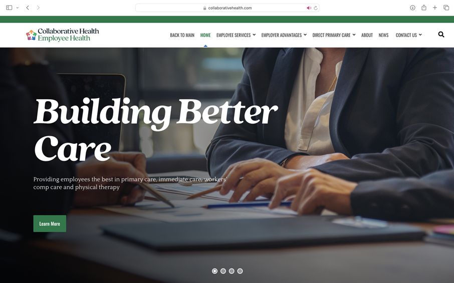
We decided that it would be best to utilize the colors from the logo to establish the different segments.


With the brand solidified, it was time for the official brand launch! This included changing the name on all current items, social media posts, outdoor designs and more.
4. Website Launch
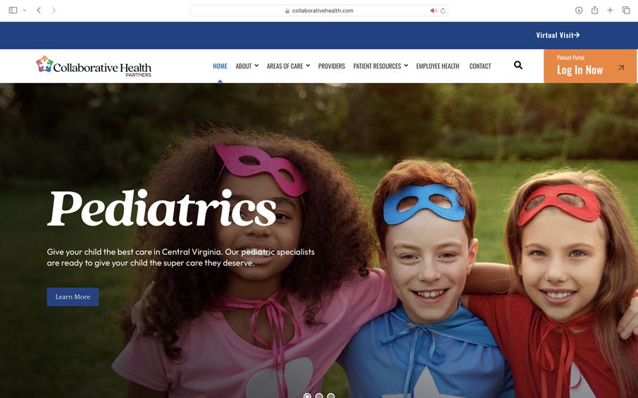
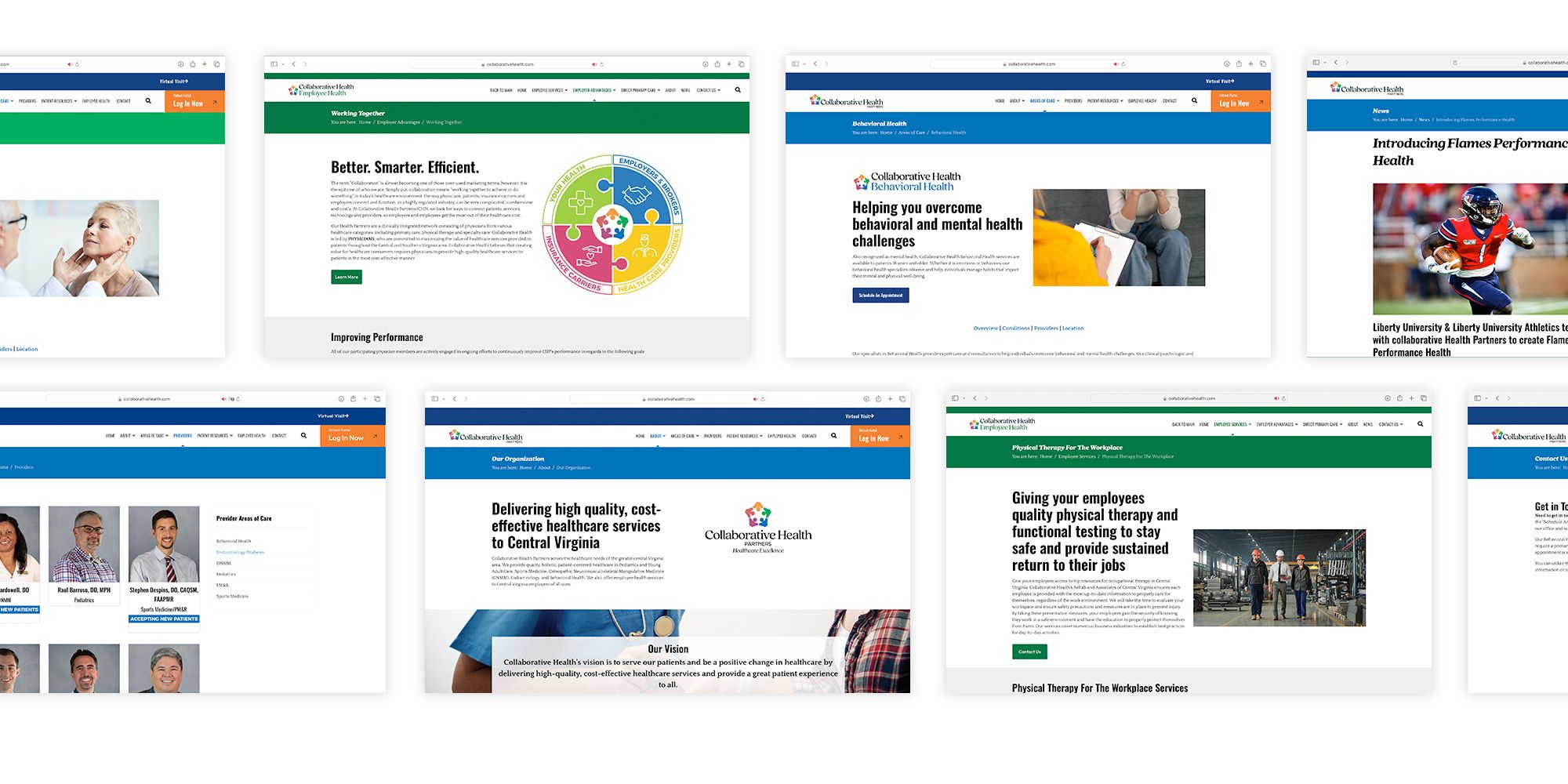
The website was a labor of love. Working with the powerful content management system (CMS), Joomla!, we were able to make a dual-purpose site that featured the public-facing and Employee Health sides of the business.


Having two sites in one allowed us the flexibility to add a ton of content, while still keeping simple navigation and page flow.

5. Supporting Collateral & Deliverables
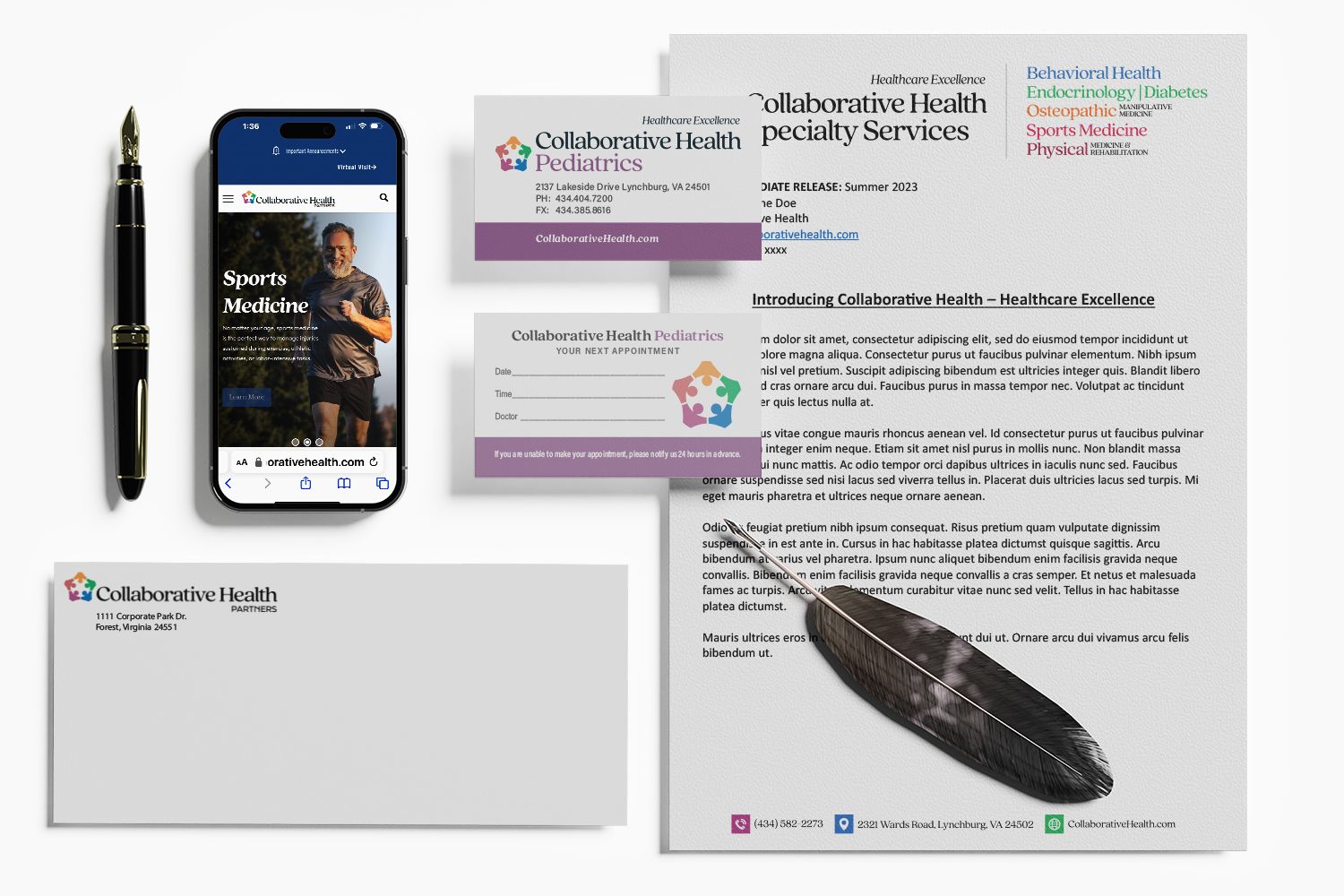
The part that is often forgotten in any new brand launch is the supporting collateral and deliverables. It is often that these pieces become an afterthought instead of a main part of the rebrand. The collateral can include, but is not limited to:
- Business Cards
- Letterhead & Stationary
- Brochures
- Rack Cards
- Specialty Items
For Collaborative Health, we started with the basics, business cards, flyers, letterhead and stationary.

The Results
Collaborative Health had a successful brand launch. This merger proved that healthcare doesn't have to be boring and categorized in the good design category. You can be a strong healthcare entity with a brand, website and collateral that matches the status of the organization.
Collaborative Health is now in a place to receive even more business as it continues to grow under one name and with a strong brand identity.
Looking to rebrand and need a strong team to help you accomplish it? Get in touch with Stimulus Advertising today.