HOME Magazine
Website Redesign
Prepare for Visual Impact
Visual impact comes in all shapes and sizes…that’s not quite the right phrase. We’ll try it again. Impactful visuals come from all different types of inspiration. Sometimes it’s a beautiful landscape or a photo of strength as a human stands vulnerably in front of a lens. Other times it is as simple as a delicate flower or a raindrop resting upon a leaf.

One of these impactful photos that can bring peace and comfort is that of a home. Think about it: a stunning garden shot or even a picture of a beautiful kitchen–each one holds a standard of beauty or intricacy that is intriguing and causes one to ask more questions about its story. This is true of Central Virginia HOME Magazine, who works to tell captivating stories of homes and gardens throughout Central Virginia, Smith Mountain Lake and the Roanoke Valley.
Since we were already a fan of HOME Magazine, it was no surprise that we were more than happy to help them achieve their goals with a new website.
The Problem
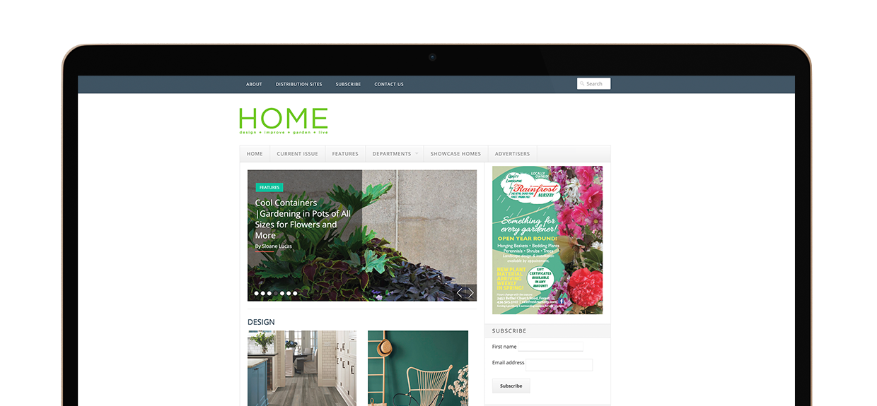
HOME Magazine’s current site was limited and made the imagery secondary within the overall design. With a fixed-width layout, there wasn’t much room for creativity and to tell a visual story online. That’s where Stimulus came in.
Some Background Information
HOME Magazine publishes three different magazine lines throughout the year. These publications are:
-
Central Virginia HOME Magazine (published five times a year)
-
Roanoke Valley HOME Magazine (published five times a year)
-
Smith Mountain Lake HOME Magazine (published once a year)
Each publication features tips for how to care for, design and renovate your home, as well as how to live a healthier lifestyle. One of the most popular sections of the magazine is the featured home portion. Both the Central Virginia and Roanoke publications feature local homes that are unique to the community. These featured home segments tell a story about the home and its owners, providing beautiful photos that enhance the story and make any reader want to go and visit the home.
Now, back to the task at hand.

The Goal
There was one simple and overarching goal for this website – or should we say these websites – and it was to create an online presence that provided a strong visual impact while clearly representing what HOME Magazine is all about. This overarching goal had some subpoints in mind, which included the following:
-
An easy path for users to find the stories they cared about most
-
A way for the magazine to get subscribers
-
A design that reflected the brand
Our Process
Our goals were set and it was time to begin the web design process. Because of its impact on the community, we knew we needed a website that was user-friendly (this was going to be an online version of the magazine for goodness’ sake). We also knew that the design needed to be clean and modern, while also offering a canvas for their photos. From there we got to work.
One key thing about this website was that it was built in WordPress—a content management system that doesn’t normally work with. While it was different, we were able to give the client a beautiful design that maintained the same standard of design that we give to all of our Joomla websites.

We began the process by creating a menu tree that would work well for those visiting the site. Afterward, we used that menu tree to determine the items that would need to be readily available on the home page of the website.
Believe it or not, the home page can be one of the most difficult pages to create. Many will overcrowd it with too much information and chaotic order of importance. At Stimulus, when we design a home page, we ensure that each item is assigned a value. From there, we work to keep the most important items easily accessible, letting the least important items drift to the bottom of the home page.
Once the menu and home page were completed, we were able to build out the rest of the pages of the site, transferring content from the old site to the new site. We resized any images and ensured that a proper system was set up so that the website could continue to grow with the client.
The Results
The final website was submitted and approved. Unlike our normal website process, this time we had to do two different websites. One for each of the magazines in Central Virginia and in Roanoke. For some this could be a tedious task; however, with the design we implemented for the first publication, it was simple to do the other one efficiently and effectively.
By the end, HOME Magazine was left with two beautiful websites that reflected the brand and achieved their goals.
The Features
1. A Unique Slideshow and Landing Page Visual
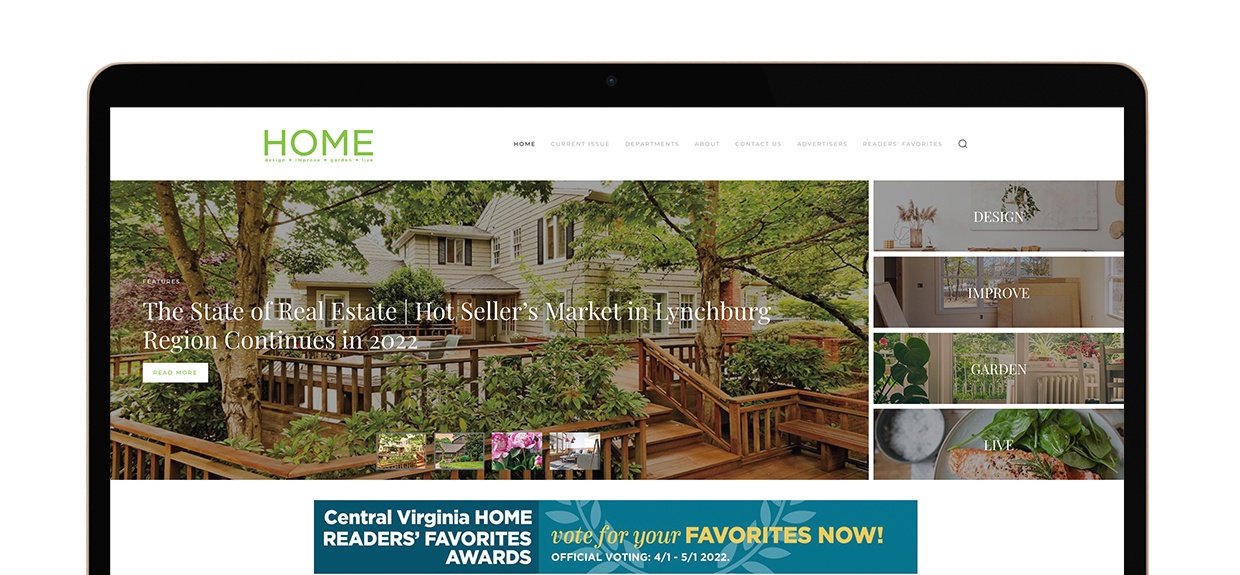
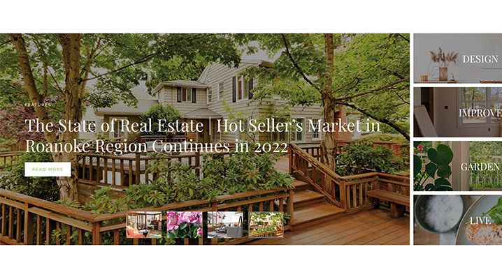
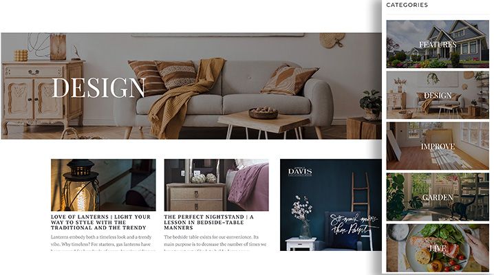
We created this unique header space that featured the slideshow and the main four categories of the publication. While the slideshow houses the featured articles that HOME Magazine would like to highlight, the side-column image boxes provide a navigatable standard set of categories for articles. Users can easily click and see the latest articles for any main category.
2. Beautiful Cover Photos that double as a navigational tool when inside of an article or category
Each category has an image that doubles as a side menu for easy accessibility and recognition. By keeping the images the same, users have a visual representation to inform them that they are in the correct place. These same categorical images are used on the home page as well.
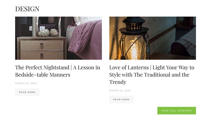
3. A grid highlight showcasing the latest additions
Each of the four categories: Design, Improve, Garden and Live, are featured underneath the main header. Each category showcases the latest additions to the website. By placing the “View Full Category” button (dressed in vibrant green) right below and to the right, the user can understand that more articles are available to read.
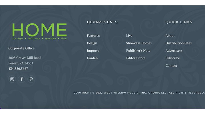
4. A patterned footer
The website features a patterned footer that helps tie everything together. This footer features the same branding present on other HOME Magazine print materials. Subtle but apparent, this is just a final detail that adds a delicacy to the website, bringing the site together in a harmonious way.
Like what you see? What are you waiting for? If you need a new website that captures your brand and makes a visual impact, give us a call. We would love to help you tell your brand story and provide a great face-to-the-market for your current and potential customers.
No more boring websites! Give your company the website it deserves and contact Stimulus today.
