

Sacramento Google Font Pairing
Following our blog post about "The Curse of the Wedding Font,” we decided writing showcasing some of our favorite script fonts and their best pairings would be fun. Join us as we continue our font pairing saga with the Sacramento font family. Haven't heard of it? Well, now you have. Once again, we want to answer the question:
“What font goes best with ____________?"
Let's get started!
History
Sacramento was inspired by the hand-lettered brochures and advertising artwork of the 1950s and 60s. Created by designers Jim Lyles and Brian J. Bonislawsky, it blends vintage charm with modern simplicity.
According to Google Fonts, “the Sacramento typeface is a monoline, semi-connected script inspired by hand-lettering artist brochure work of the 1950s and 1960s. It stands on a thin line between formal and casual lettering styles, yet it has a commanding presence for headlines and titles.”
In short? It’s a retro beauty with just the right touch of sophistication.
Font Pairing 1: Urbanist
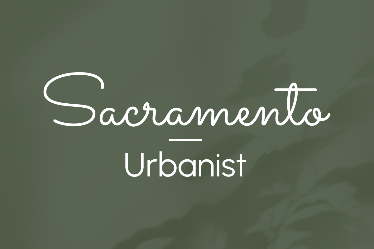
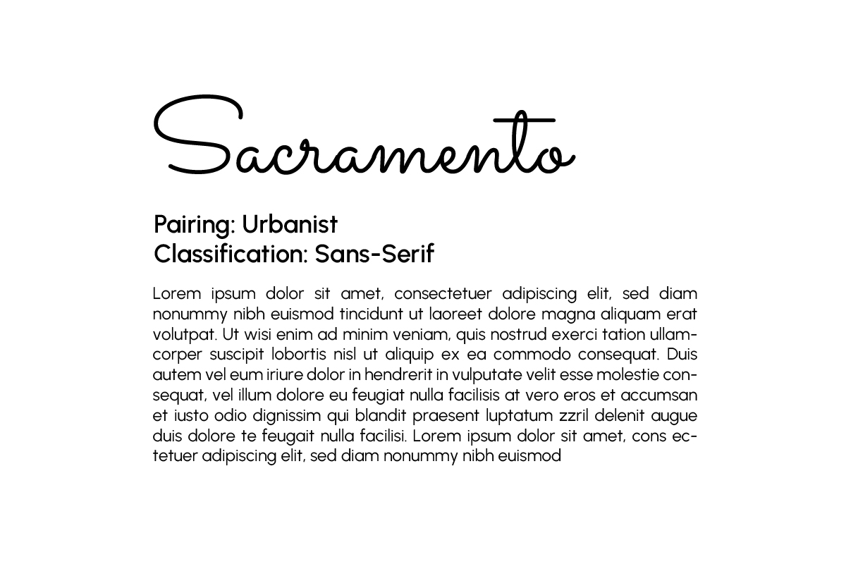
Classification: Sans-serif
Use: Body Text
Urbanist is a great font to pair with because it is neutral and versatile. Allowing Sacramento to take center stage and shine as a heading, Urbanist is best utilized as a body text in this pairing. As a clean, geometric, and highly versatile sans-serif, Urbanist brings a modern look to a pairing with a script font such as Sacramento.
Font Pairing 2: Lora
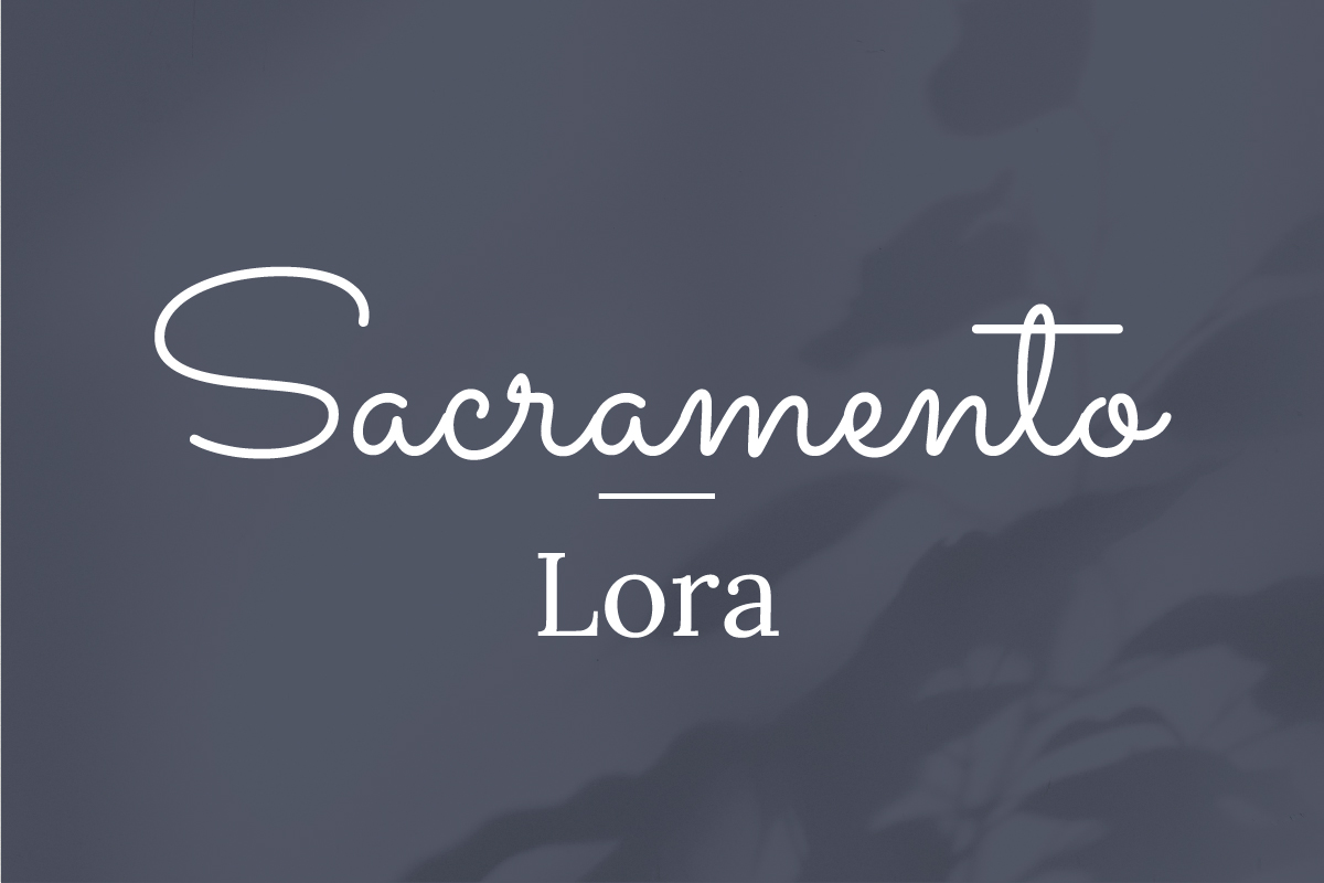
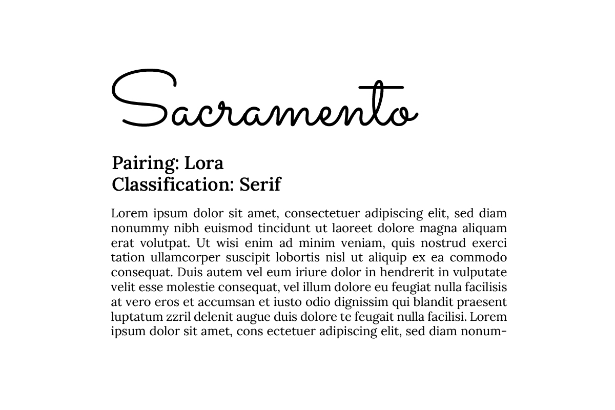
Classification: Serif
Use: Body Text
For a more classic aesthetic, Lora brings a traditional serif structure. Contrasting with the rounded cursive of Sacramento, Lora provides a more structured look with its consistent forms and serifs. Lora is a solid choice for print materials and editorial-style layouts.
Font Pairing 3: Fira Sans
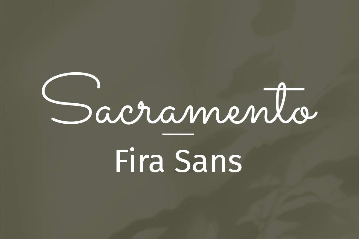
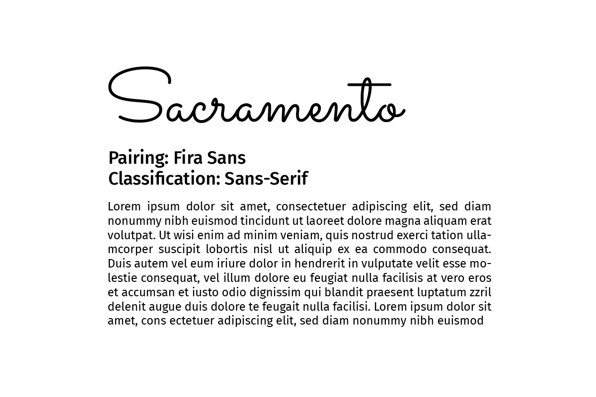
Classification: Sans-Serif
Use: Body Text
Fira Sans offers a slightly more condensed structure compared to Urbanist, adding a different flavor to your pairing. It keeps things clean and modern but adds a subtle contrast with Sacramento’s wide and airy form. A great fit for digital projects that need a polished, contemporary look.
Font Pairing 4: Alice
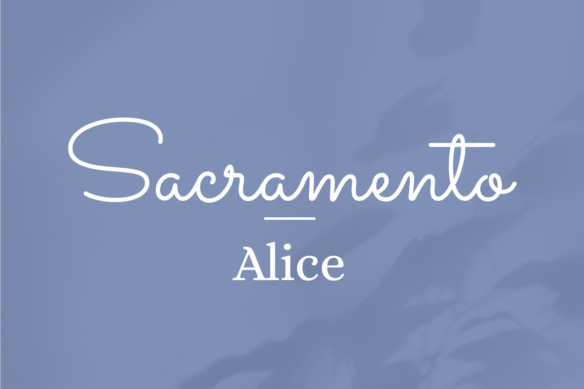
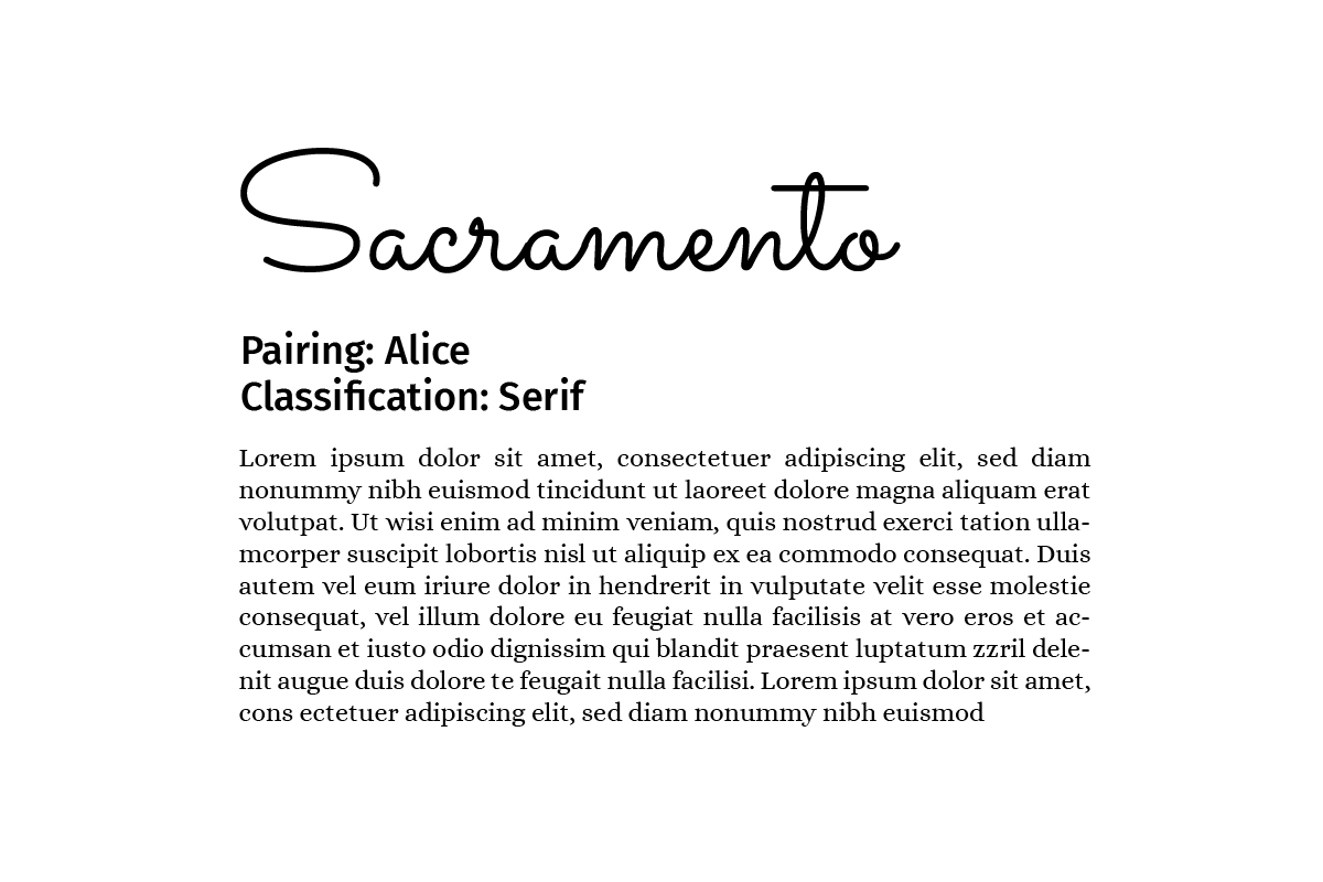
Classification: Serif
Use: Body Text
Alice is a serif font with a lot of personality! Its unique curves and smooth quality make it feel feminine, which compliments the soft feel of the script font. Alice has a gradual thick-to-thin contrast on its letterforms, making it feel balanced and smooth. It was also designed for the typesetting of a book, making it a great choice for large sections of body text.
Providing you with great font pairings is our pleasure and we truly hope you stick around for more in the future! Be sure to follow along as we continue our journey to provide perfect font pairings for all designers looking to elevate their projects! Let us know on social media which font you want to see next!
NEED A HAND WITH YOUR NEXT DESIGN PROJECT?
Stimulus Advertising is a full-service marketing and advertising agency. We work to provide creative services to companies and organizations within a variety of business segments and markets. If you are looking for a team to help you with your next design project, look no further than Stimulus! Our team of highly-trained designers and web developers will help you with anything from a new logo/brand to a new website and everything in between. Contact us today to learn more about our services and tell your brand story!